Apps
App Icons: Free App Icons for Mobile Apps, iPhone, and Android

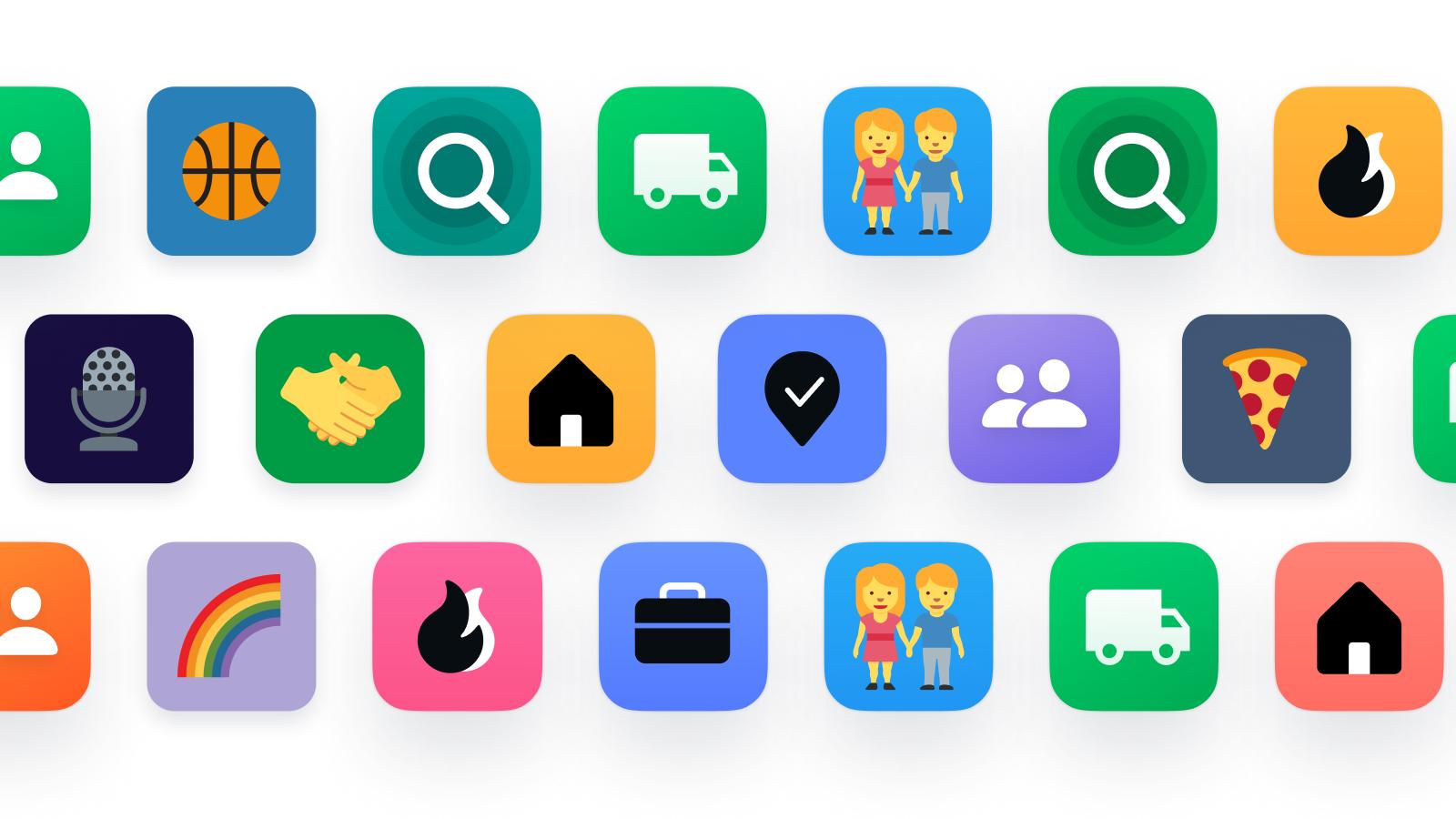
App icons are an important part of how people recognize and interact with mobile applications. They are the small graphics displayed on smartphone home screens, app stores, desktop applications, and digital platforms. A well-designed icon helps users identify an app quickly and understand its purpose without reading its full name.
Whether you are looking for free app icons, creating a new mobile application, or customizing your phone’s home screen, there are many designs and tools available.
You can find app icons in different styles, including colorful, minimalist, flat, 3D, cartoon, and outline designs. Some collections provide ready-made PNG and SVG files, while other tools help developers turn a single image into multiple icon sizes for different devices.
In this guide, you will learn about different types of app icons, where to find them, how to create custom designs, and how to choose the right format for your project.
What Are App Icons?
App icons are small visual graphics that represent software applications. They appear in different places, including mobile home screens, application menus, app stores, desktop interfaces, and websites.
For example, a camera application may use a camera symbol, a music app may display a musical note, and a messaging application may use a speech bubble.
The main purpose of an app icon is to make an application easy to recognize. Instead of searching through a list of names, users can identify their preferred applications through familiar visual symbols.
App icons are also an important part of application branding. Their colors, shapes, and illustrations help create a recognizable identity for an app.
Different Types of App Icons
App icons come in many styles and categories. The right option depends on whether you need graphics for a mobile application, website, software interface, or personal phone customization.
1. Mobile App Icons
Mobile app icons are designed for applications installed on smartphones and tablets. They appear on the home screen, application drawer, and other areas of the device interface.
Common examples include camera, calculator, shopping, music, messaging, and social networking icons.
These icons should be easy to recognize at small sizes. Simple illustrations and clear shapes usually work better than complicated designs.
2. iPhone App Icons
iPhone app icons represent applications on Apple devices. They are designed to work with Apple’s visual interface and display requirements.
You can find different styles, including colorful illustrations, minimalist graphics, aesthetic designs, and custom icons.
If you want to change the appearance of your iPhone home screen, you can use the Shortcuts app to create custom home screen shortcuts with your preferred images.
3. Android App Icons
Android app icons are used on smartphones and tablets running the Android operating system.
Developers can create launcher icons that work with different device densities and adaptive icon shapes.
Android also supports themed icons on compatible versions and launchers. This gives applications more flexibility when matching the appearance of a device’s home screen.
4. Social Media App Icons
Social media icons represent popular communication and networking applications.
Examples include:
- Instagram icons
- Facebook icons
- TikTok icons
- Pinterest icons
- Snapchat icons
- WhatsApp icons
- YouTube icons
These graphics are useful for websites, social media pages, application interfaces, and digital designs.
When using official brand symbols, follow the relevant trademark and brand usage rules.
5. Cute and Aesthetic App Icons
Cute app icons are popular among people who like customizing their smartphone home screens.
They often use pastel colors, cartoon illustrations, flowers, hearts, and simple decorative shapes.
Popular color choices include pink, lavender, beige, baby blue, and white. These designs can help create a matching theme across different applications.
6. Minimalist App Icons
Minimalist app icons use simple shapes, limited colors, and clear symbols.
They are useful for professional applications, business software, productivity tools, and modern mobile interfaces.
Because they avoid unnecessary details, minimalist icons can remain recognizable even when displayed at smaller sizes.
7. Gaming App Icons
Gaming app icons represent mobile games and entertainment applications.
They often use colorful characters, game controllers, fantasy illustrations, and bold backgrounds.
These icons are commonly used in game stores, gaming websites, promotional graphics, and mobile application menus.
Best Websites to Find App Icons
Finding the right app icon depends on your project and the type of graphic you need. Some websites focus on downloadable icon collections, while others provide tools for generating complete application icon sets.
Here are three useful platforms to explore.
Flaticon: Large Collection of App Icons
Flaticon is a resource for finding ready-made app icons and other graphic assets.
Its app icon collection includes different symbols and illustrations that can be used in digital projects. You can explore graphics for mobile applications, websites, presentations, and interface designs.
Flaticon offers free PNG downloads and additional formats through its premium plans. Free downloads may have attribution requirements, so check the license before using an icon.
Best for: Designers, bloggers, website owners, and people looking for ready-made graphics.
Explore the collection:
Browse Free App Icons on Flaticon
AppIcon.co: Create and Resize App Icons
AppIcon.co is useful for people who are developing mobile applications and need icons in the correct platform sizes.
Instead of manually resizing one image several times, you can use an app icon generator to create different versions for supported platforms.
The tool currently supports icon generation for iPhone, iPad, macOS, watchOS, and Android. It also provides an Xcode-ready asset catalog for Apple development projects.
Its resizing feature is useful when you already have a finished design and need platform-ready files.
Best for: Mobile app developers who need properly organized icon assets.
Visit the tool:
Create App Icons with AppIcon.co
Icons8: Explore App Icons in Different Styles
Icons8 provides a large collection of icons for different applications and design projects.
You can browse app related graphics and explore different visual styles. The platform also provides options for organizing collections, changing colors, and exporting icons.
PNG and SVG are among its supported formats, although available sizes and download conditions depend on the selected icon and plan.
Best for: Designers looking for consistent icons in different styles.
Explore the collection:
How to Choose the Right App Icons
Selecting an attractive icon is only one part of the process. The design should also work properly on the device or platform where it will appear.
Consider these factors before choosing an icon.
1. Keep the Design Simple
An app icon is usually displayed in a small space. Too many details can make the image difficult to recognize. Choose a clear symbol that represents your application.
2. Select Suitable Colors
Colors help people recognize an application and connect it with its brand. Use a balanced color combination that looks good on different backgrounds.
3. Check the Shape
App icons can appear in rounded squares, circles, or other platform-controlled shapes. Keep important design elements away from the edges to prevent unwanted cropping.
4. Choose the Correct File Format
PNG is useful for ready-made graphics, while SVG is suitable for scalable vector designs. Developers should also check the required file formats for their target platform.
5. Test the Icon at Small Sizes
A design that looks attractive at 1024 pixels may not remain clear when reduced. Preview your icon at smaller sizes before using it.
6. Maintain a Consistent Style
If you are creating a collection of icons, use matching colors, shapes, and visual styles. Consistency makes an interface look more professional.
PNG vs SVG: Which Format Is Better for App Icons?
PNG and SVG are two common formats used for app graphics. Both have different advantages.
| Feature | PNG | SVG |
|---|---|---|
| Image type | Raster | Vector |
| Transparency | Supported | Supported |
| Scaling | Can lose sharpness | Stays sharp |
| Editing | Image editor | Vector editor |
| Best use | App graphics and images | Interface and scalable graphics |
PNG is a practical choice for finished application graphics and images that need transparency.
SVG is useful when you need to resize or edit vector artwork without losing quality.
However, do not assume that every app store accepts SVG as its final application icon. Some platforms require specific raster image assets.
How to Create Your Own App Icons
If you cannot find an icon that matches your application, you can create a custom design.
You do not need complicated design software to get started. An image editor or graphic design tool can help you make a simple application icon.
Follow these steps:
Step 1: Decide What Your App Represents
Start by identifying the main purpose of your application.
For example, a fitness app may use a running figure, while a shopping app may use a shopping bag. The symbol should communicate the app’s main function.
Step 2: Choose a Color Combination
Select two or three colors that work well together.
A finance application may use blue and green, while a creative application may use brighter colors. Keep the background and main symbol easy to distinguish.
Step 3: Create a Square Design
Start with a square image and place the main symbol near the center.
For many modern app icon workflows, a 1024 × 1024 pixel master image is a useful starting point. Always check the current platform requirements before exporting.
Step 4: Keep Important Elements Inside Safe Areas
Some devices and platforms apply masks or rounded shapes to icons.
Avoid placing important text or illustrations too close to the edges. Preview the design in different shapes to make sure it remains recognizable.
Step 5: Export Your Design
Save your finished design in a suitable format.
For example, you may export a PNG image for a mobile application or an SVG file for a scalable interface graphic.
Step 6: Generate Platform Sizes
If you are developing an app, use a suitable icon generator to prepare the required assets.
Tools such as AppIcon.co can generate platform-specific files from a master image, helping reduce manual resizing work.
App Icon Sizes for iPhone and Android
App icon sizes depend on the operating system, device, and intended use.
For example, an iPhone application has different asset requirements from an Android launcher icon. Website favicons and app store graphics also have their own specifications.
Here is a simplified reference:
| Platform | Common icon requirement |
|---|---|
| iOS App Store | 1024 × 1024 px |
| Android Play Store | 512 × 512 px |
| Android launcher | Multiple density sizes |
| Website favicon | 16 × 16 and 32 × 32 px |
| Apple touch icon | 180 × 180 px |
These are common reference sizes, not a complete specification for every device or platform. Requirements can change, so consult the official platform documentation or use a generator that follows current requirements.
Common App Icon Design Mistakes
A poor icon can make even a well-developed application look unfinished.
Here are some mistakes to avoid:
Using Too Much Text: Small text is difficult to read on a home screen. A simple symbol is often more effective.
Choosing Similar Colors: If the background and symbol have similar colors, the design may become difficult to recognize.
Adding Too Many Details: Complex illustrations can lose clarity when displayed at smaller sizes.
Ignoring Platform Requirements: An icon may look correct but still fail technical requirements if its dimensions or format are incorrect.
Using Low-Quality Images: Blurry or pixelated graphics can reduce the overall quality of an application.
Ignoring Licensing: Downloaded graphics are not automatically free for commercial use. Always review the license and attribution requirements.
Frequently Asked Questions About App Icons
What are app icons used for?
App icons represent software applications on smartphones, tablets, computers, and websites. They help users identify applications and make digital interfaces easier to navigate.
Where can I download free app icons?
You can explore app icon collections on Flaticon and Icons8. Both offer different styles and formats, although free downloads may have specific licensing and attribution requirements.
How can I create an app icon for Android?
You can create a square design using an image editor and then use an app icon generator to produce the required Android launcher and store assets.
What size should an iPhone app icon be?
A 1024 × 1024 pixel image is commonly used as the App Store master icon. Additional asset requirements depend on the Apple development workflow and target platform.
What is the best format for app icons?
PNG is commonly used for finished app graphics. SVG is useful for scalable vector designs and interface elements. The correct format depends on the platform and purpose.
Can I change app icons on my iPhone?
Yes. You can use the Shortcuts app to create custom home screen shortcuts with different images. This changes the shortcut appearance rather than replacing the original application’s store icon.
Can I customize Android app icons?
Yes. Many Android devices and launchers support custom icon packs and individual icon changes. Available features depend on the device and launcher.
Are free app icons safe for commercial projects?
Some free icons allow commercial use, while others require attribution or have restrictions. Read the individual license before including an icon in a commercial application or website.
Final Thoughts
App icons are more than small pictures on a smartphone screen. They help users recognize applications, improve navigation, and create a consistent visual identity.
If you need ready-made graphics, platforms such as Flaticon and Icons8 offer different icon collections. If you are developing an application, AppIcon.co can help generate and organize the required icon assets.
The best app icon is simple, recognizable, visually balanced, and suitable for its intended platform. Take time to choose the right design, check the technical requirements, and review licensing before publishing your application.
The Hear UP is a leading technology publication house. Our origin dates back to 2016 as a small forum for technology enthusiasts. Since then, The Hear UP has transformed into a trusted source for emerging tech and science news.
The majority of our news is provided by staff writers. Other news is provided by news agencies and freelancers.
All of our contributors are members of the Society of Professional Journalists.
If you need to contact a news editor from The Hear UP you can find a list of email addresses on our contact page.
Our Organisation
The Hear UP