
Apps
The Importance of Thoughtful Empty State Design in Mobile Apps
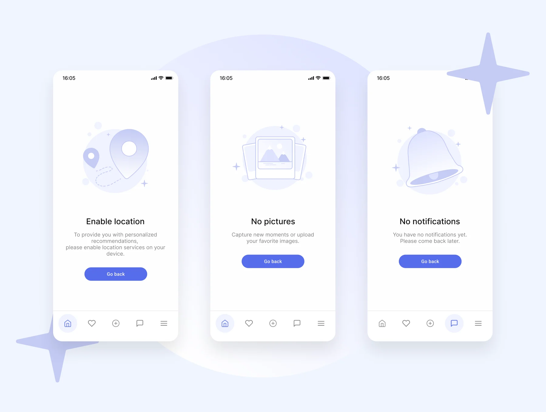
Table of Contents
- Understanding Empty States
- Types of Empty States
- Key Components of Effective Empty States
- Best Practices for Designing Empty States
- Common Mistakes to Avoid
- Real-World Examples
- Conclusion
Empty states in mobile applications are a crucial, yet often underappreciated aspect of user experience. These are the screens users see when no content is displayed, such as upon first using an app, after clearing data, or when a search returns no results. Effective empty state UI design transforms potentially confusing or discouraging blank screens into valuable opportunities for user engagement and onboarding.
Rather than serving as dead ends or empty states, when thoughtfully crafted, they can reassure users, explain the situation clearly, and suggest actionable steps forward. In today’s highly competitive app market, attention to these states can differentiate an app, ensuring users feel guided and supported from their very first interaction. Ignoring these moments can leave users unsure what to do next or question whether the app is functioning correctly. Clear, empathetic empty state design addresses these pain points, improves retention, and helps users build confidence in navigating your app. Additionally, well-designed empty states reinforce an app’s tone and personality, making the UI more welcoming and relatable. When paired with smart visuals and inviting language, the empty state becomes a device for brand strengthening and user delight.
Understanding Empty States
Empty states occur when no data is available to display in a specific area of an app. This may happen for several reasons, including a user’s first time in the app, completing every possible action so nothing remains, clearing their data, or making a search that yields no matches. Despite being such a common scenario, empty states are often treated as an afterthought in the design process. When these states are carefully planned, they become moments to guide, educate, and engage users. They can introduce new features, explain why a screen is empty, and gently nudge users towards the app’s intended actions, supporting both usability and retention.
Types of Empty States
Different circumstances require unique approaches to empty state design. The most common types of empty states include:
- First Use: When a brand-new user launches the app and has not created or added any data yet. The goal is to set expectations and invite the user to take their first step.
- User Cleared: If the user has finished or deleted all items, tasks, or content. This scenario celebrates completion but also encourages continued activity.
- No Results: Occurs when a filter or search returns nothing, needing suggestions or tips for refining their search or trying again.
- Error State: When a technical issue prevents the app from displaying content. Clear messaging and troubleshooting steps are essential here.
Understanding the context for each empty state ensures your design meets user needs and expectations at every step.
Key Components of Effective Empty States
A successful empty state typically contains several key ingredients:
- Visual Element: Use an illustration or friendly icon that visually represents the situation or mood. This helps reduce user frustration and provides clarity.
- Message: Include a concise, informative line of text explaining what has happened and why the page appears empty.
- Call to Action (CTA): Offer a compelling and realistic next step, guiding users to interact with the app in a meaningful way. This might be an “Add Item” button or a tip for refining a search.
For example, replacing “No items found” with “It’s quiet here. Start by adding your first item” can not only clarify the situation but also create a warmer, more human touch.
Best Practices for Designing Empty States
- Provide Clear Guidance: Make it immediately apparent why the screen is empty and how the user can proceed. Avoid ambiguous messages.
- Use Friendly Language: Maintain a conversational and approachable tone that aligns with your brand voice, making your app feel welcoming and supportive.
- Incorporate Visuals: Design relevant illustrations or icons that reinforce the context without becoming distracting.
- Offer a Clear CTA: Ensure that a simple, actionable button or suggestion is available to direct users to their next step.
- Maintain Consistency: Keep empty state styles and language in sync with the rest of your app’s design system and voice.
Common Mistakes to Avoid
Poorly executed empty states can confuse or frustrate users, ultimately harming engagement. Common pitfalls include:
- Vague Messages: Avoid cryptic or generic messages such as “No data available” that fail to explain or guide the user.
- Lack of Direction: Screens that do not include next steps or actionable suggestions can leave users feeling lost or uncertain.
- Excess Complexity: Providing too much text or overwhelming graphics adds cognitive load. Balance information and simplicity.
Always prioritize clarity, guidance, and user empowerment over excessive explanation or ornate visuals.
Real-World Examples
To illustrate the impact of empty state design, consider a task management app. When a new user opens the app, an illustration of an empty checklist appears alongside the message, “You’re all set to get organized. Tap ‘Add Task’ to begin.” This not only clarifies why the screen is empty but also encourages immediate engagement and helps eliminate uncertainty. Similarly, in messaging apps, the absence of conversations is often paired with playful graphics and tips for starting a new chat, guiding users gently. Another example is on photo-sharing platforms, where a first-time user sees artwork indicating their gallery is empty, along with instructions on how to upload their first photo. This approach reduces intimidation and minimizes the learning curve, making the app accessible from the start.
Conclusion
Empty states are pivotal moments in the user journey, especially in mobile apps where clarity and engagement are essential. Thoughtfully designed empty state screens convert potential confusion or drop-off points into opportunities for education, action, and connection. By prioritizing clear messages, engaging visuals, and actionable guidance, designers can ensure users feel confident and motivated to explore the app’s value fully.
The Hear UP is a leading technology publication house. Our origin dates back to 2016 as a small forum for technology enthusiasts. Since then, The Hear UP has transformed into a trusted source for emerging tech and science news.
The majority of our news is provided by staff writers. Other news is provided by news agencies and freelancers.
All of our contributors are members of the Society of Professional Journalists.
If you need to contact a news editor from The Hear UP you can find a list of email addresses on our contact page.
Our Organisation
The Hear UP