Business
All the Elements That Your Letterhead Design Should Have

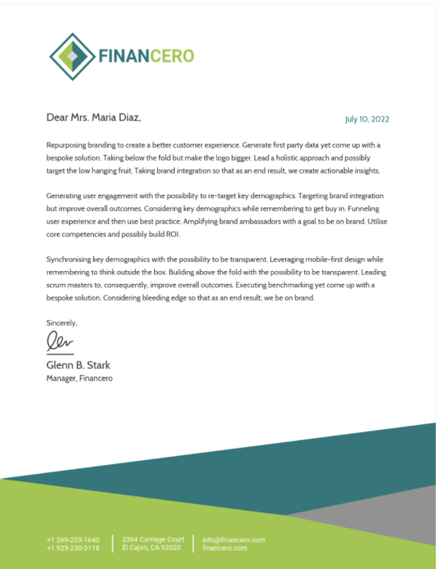
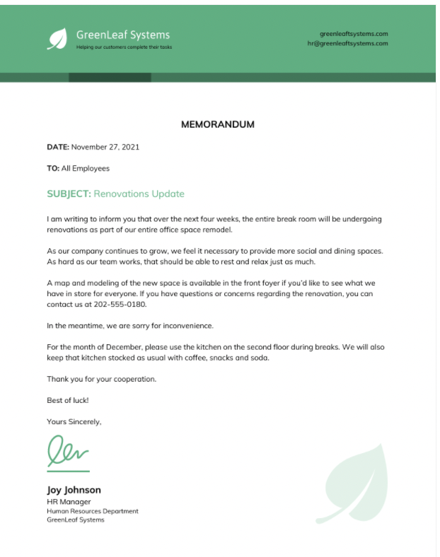
A letterhead design is basically an identity for your business, company, or organization. It should be well-thought of because it will serve as the business card of your business; it will act as something to distinguish you from the rest. So what must a good letterhead have?
Here are some of the things that can make your letterhead design stand out:
1. A Company Letterhead Focuses on Fonts and Typography
You may use a few fonts in a single letterhead but it is best if you stick with one or two types of font for all the parts of the letterhead–main text and subsidiary texts such as datelines, salutations, closings, etc.–using different sizes to give emphasis on some parts over others. Don’t just use fonts haphazardly; make sure that your font matches the kind of products or services that you offer.
2. Colors
It would be best if the colors that you will use for your letterhead design fit the identity of your business, too. If you are a financial company, look for bright colors to symbolize optimism and growth while using conservative colors for others types of businesses so as not to give an impression of being overbearing with regards to customers.
3. Your Business Letterhead Layout Should Be Simple
If it is possible, avoid crowded designs because these may just confuse people–especially those who are new clients or customers–and deliver conflicting messages, rendering your letterhead ineffective in doing its job which is to catch people’s attention quickly. Try making some margins around the elements on your letterhead as well as centralize it as much as possible.

4. Keep Your Company Letter Head Simple
Keep your design simple–with less imagery and fewer colors if you’re going for a minimalist design to make sure that nothing will take away from the main purpose of your letterhead which is to deliver messages clearly and quickly. Remember: fun and complex designs may look beautiful and artistic but usually, these sacrifice legibility and clarity. So aim to be functional!
If this is a bit hard for you then just use Venngage, the pound-for-pound best letterhead and cv maker on earth!
5. Call-to-Action
Adding a call-to-action on your letterhead design may be useful in making sure that people will remember what you do and how they can contact you or get more information about your products or services. A good example of this is adding QR codes on the letterhead; it’s easy to use, affordable, and accessible for most mobile devices today.

6. Keep Your Official Letterhead Consistent
Remember that the elements that you put on your letterhead should all be consistent with one another; make sure that they are consistent with other printed materials like business cards–and even websites–so there will be no confusion when someone views them all at once!
7. Make it Unique
A good design of a letterhead is unique. It must be different from your competitors so as not to appear copycat and leave a lasting impression on your client that you are serious about what you do.
One way of making sure that your design is unique–and effective at the same time–is by looking for inspiring designs online, giving credit when possible of course! And adding a bit more personal touch would help too, such as images or photos of some employees or team members to make them feel included in whatever it is that you do.
8. Make Sure Your Professional Letterhead Fits Your Needs
Include all the important information on your letterhead but avoid those which are unnecessary; keep those that will stand out and won’t create a lot of distractions from the main purpose of having your letterhead.
If you want to add more information on it, give yourself some freedom by designing an inside page for your letterhead which will be the place where you can put anything that might not fit on the outside.
9. Think About Your Budget
You don’t have to break your bank account just so you can get that perfect and aesthetic design for your letterhead; there are various ways to achieve this starting with sales promotions and discounts offered at printshops near you–or better yet, host a printing sale yourself!–online quotes and promotional codes, and asking around from people who may know someone or something about printing services.
10. Don’t Forget to Include Your Contact Details
Whether you’re printing a high-quality and expensive letterhead or not, always include your contact information on it. It’s useless to have an impressive and aesthetically pleasing letterhead design when readers are unable to contact you because there is no way for them to do so!
Remember: the point of having a letterhead is sending messages quickly and effectively as possible. Keep those things in mind and you’ll see how much easier it will be for you to create a memorable and distinct letterhead design for your business or personal needs.
Conclusion
Remember: letterheads are the first thing that people will see and use to contact you. So make sure that you pay attention to elements such as simplicity, functionality, consistency, and your budget when creating your design!
Having a simple yet creative and memorable letterhead will help you achieve more clients and promote your business as well as yourself as a serious professional who values his or her work–and by extension, his or her brand.
Kenneth is a proud native of sydney, born and raised there. However, he pursued his education abroad and studied in Australia. Kenneth has worked as a journalist for almost a decade, making valuable contributions to prominent publications such as Yahoo News and The Verge. Currently, he serves as a journalist for The Hear Up, where he focuses on covering climate and science news. You can reach Kenneth at [email protected].


