NEWS
Top 5 Common Website Interface Design Mistakes to Avoid

In today’s digital world, a well-designed website plays a crucial role in attracting and retaining customers. It has the power to either lead to successful customer conversions or drive them away.
Ensure that your website stands out from the crowd. Create a positive user experience by avoiding common interface design mistakes.
In this article, we will discuss the top mistakes to watch out for. These will offer simple and beginner-friendly solutions for optimizing your website interface design.
1. Cluttered and Complex Layouts
A cluttered and complex website layout overwhelms visitors. It makes it difficult for them to find the information they’re looking for.
To avoid this mistake, it’s important to simplify your website’s navigation. Prioritize content and embrace white space.
Simplifying your navigation involves implementing a clear and intuitive menu. Categorize your content logically. Limit the number of menu items. Use descriptive labels to help users find what they need effortlessly.
Embracing white space is essential for giving your content room to breathe. Incorporating sufficient white space enhances readability. It also creates a sense of elegance and professionalism on your website.
2. Poor Color Choices and Contrast
Colors have a significant impact on user experience. It can influence how visitors perceive your brand. Choosing the wrong colors or lacking contrast can result in poor readability. It can cause confusion and a lack of visual appeal.
Use a limited color palette. Use only those that represent your brand and evoke the desired emotions.
Stick to a harmonious combination of colors. Limit the number of primary colors to maintain consistency throughout your website. Ensure sufficient contrast between text and background elements to enhance readability.
Avoid using colors that blend or create low contrast. This can strain users’ eyes and make content hard to read.
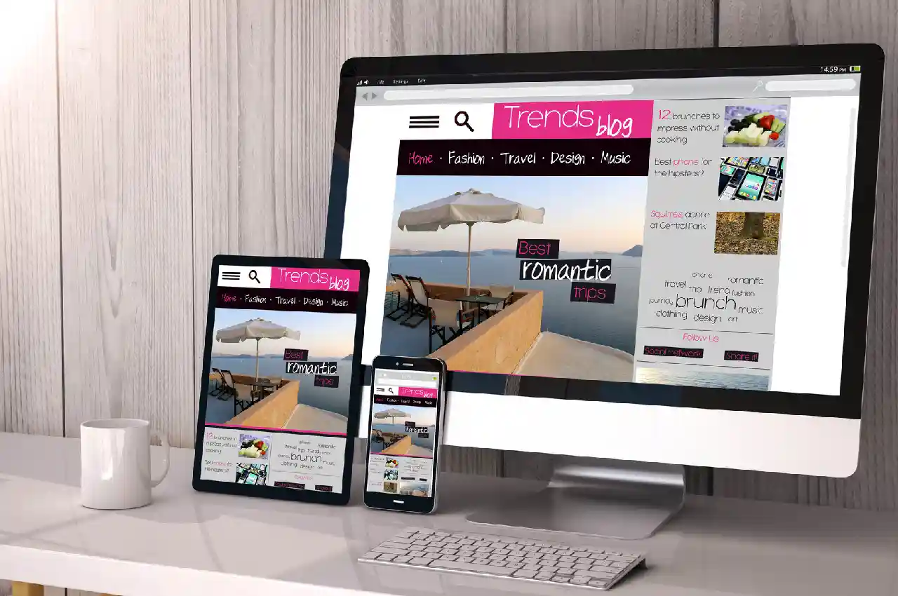
3. Neglecting Mobile Responsiveness
Having a mobile-responsive website is no longer optional—it’s a necessity, especially with the increasing number of users accessing the web through mobile devices.
Neglecting mobile responsiveness leads to a frustrating experience for users. It can result in high bounce rates.
Adopt a responsive design approach. This will allow your website to adapt seamlessly to different screen sizes. This ensures users have a consistent experience across all platforms.
4. Slow Loading Times
In today’s fast-paced world, users expect websites to load quickly. Slow loading times not only frustrate visitors but also negatively impacts your search engine rankings.
Optimize image sizes by compressing them without compromising quality. Large, uncompressed images can significantly slow down your website. So, use appropriate formats and reduce file sizes.
Reducing the number of requests your website makes to the server improves loading times. You can also find more information here about how to optimize your website.
5. Lack of Clear Call-to-Action
A website without clear call-to-action elements fails to guide users toward desired actions. This results in missed conversion opportunities.
Use persuasive language for your CTAs. Craft compelling and action-oriented text. Communicate what users should do next, whether it’s signing up, making a purchase, or contacting you.
Make CTAs stand out by using contrasting colors, whitespace, and visual cues. Ensure they are easily identifiable and strategically placed within the user flow.
Creating a Captivating Website Interface
Make sure to avoid these common website interface design mistakes we have shared. With these, you can create a user-friendly and visually appealing website. You can even captivate your visitors and boost conversions.
Remember to focus on simplicity, clarity, and responsiveness while incorporating visually pleasing elements. So, get started today!
If you think this article is helpful, check out our other blogs!
Having completed my education in English, I’ve cultivated a successful career as a content writer. My tenure includes valued collaborations with distinguished professional organizations, reflecting my commitment to producing high-quality content.
Contact me on this mail: [email protected]


