
Latest News
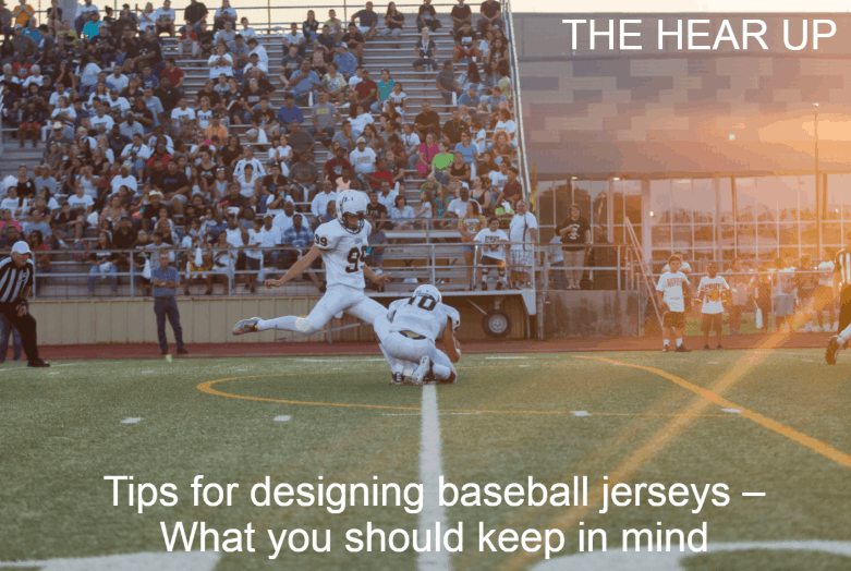
Tips for designing baseball jerseys – What you should keep in mind
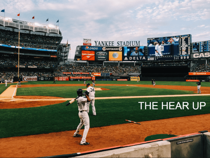
Baseball jerseys
If you are a baseball enthusiast just like me, the season for sport is always around the corner. And if you are a coach, a manager, or a mentor for amateur/professional baseball teams, then there is never a bad time to think about how to make your team look professional in front of the opponents
What your players wear on the baseball field can go leaps and bounds towards reflecting their feel for the game. Outfitting them in well-crafted baseball uniforms, and they will surpass their limits and develop a strong bond for the game that supporters will remember for a long time
At a time when people are complaining about the lack of support in baseball, teams are looking out for new and exciting ways to make their baseball jersey look upbeat and professionally appealing.
In this blog post, we will discuss some of the tricks and tips we have for designing the right set of baseball jerseys.
if you are interested in sport you should check our website https://www.techlux.ga/ for daily tech style and gear
Your choice of colors will give you a competitive advantage
If you have seen the shades and colors for the baseball uniforms in the past, you would know what I’m talking about right now. The vintage color combinations from the 60s and 70s are back and are creating an astounding impact on the people.
As it should be, blue is the warmest color and should be more used by teams in the uniforms. Back in the day, Saint Louis Cardinals would rock on and impress everyone with their color combinations. The uniform became so popular that people actually started following in a similar suit.
To this day, it has become an epitome of their uniform spirit, and people have loved it so much that they brought the color combination back for the 2019 season. The team had a competitive run back in the day, and they did ignite a fire among the players and supporters with that combination.
Since a lot of warmer colors are in fashion, there are some don’ts that you should know about. Among them is the all-black combination for baseball uniforms. I surely understand why teams choose black color for the uniforms, because it goes well with their logo and their uniform philosophy.
But before jumping to conclusions, hear me out. Even though the color looks pretty dominating, which you can use for your advantage, it will also look much better than white. But if your baseball team is prone to playing in the light, you will be putting in a disadvantage.
The main reason for that is because black color soaks up the light and changes it into heat, which is one of the reasons why so many professional teams have stopped using the black color in the uniforms.
Among other color combinations that normally gets a nod from the supporters is the grey color. This combination of black and white, grey is the ideal color for baseball uniforms. It is common for sure, but that is precisely the point. It does not soak up the light and changes into heat like the black color, the stains are not visible, and it looks clean and crisp.
Another interesting fact is that it gets along with any other color, which is one of the reasons why so many professional and amateur teams use it for their uniforms.
Styling your baseball uniforms with graphics, letters, and numbers
This may seem like an unpopular opinion, but pinstripes are my ultimate choice for uniforms. They may seem to fade away in the current fashion trends, but in the baseball uniforms world, they are absolute gold. Seasons after seasons, teams have used them in their uniforms and make the players feel special.
For some reason without stripes, baseball uniforms don’t really look like baseball uniforms. They create a feeling that is difficult to describe, but every baseball enthusiast would know what I’m talking about. They just don’t go out of style.
Another interesting thing about the stripes is that they make a bad uniform look good. Earlier, we talked about how white color looks bad in the uniforms, but if you pair it up with stripes, then you are creating an appealing look.
One thing that teams should avoid is the designing of large graphics on uniforms. There was a time when MLB thought of it as a brilliant idea, but the designs on the uniforms turned out to be worse than anybody could imagine.
However, if you want to create a pristine look, a logo on the left chest would do just fine. Your jersey number on the right and your logo on the left will create a killer look for your uniforms. And it is something that the fans will remember for a long time.
The Hear UP is a leading technology publication house. Our origin dates back to 2016 as a small forum for technology enthusiasts. Since then, The Hear UP has transformed into a trusted source for emerging tech and science news.
The majority of our news is provided by staff writers. Other news is provided by news agencies and freelancers.
All of our contributors are members of the Society of Professional Journalists.
If you need to contact a news editor from The Hear UP you can find a list of email addresses on our contact page.
Our Organisation
The Hear UP