
Business
Design Secrets for Business Cards That Stand Out
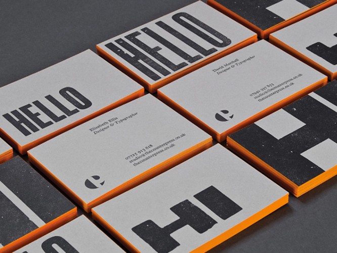
Table of Contents
- Introduction
- The Essence of Personal Branding in Business Card Design
- Crafting Your Visual Identity
- Choosing Your Colour Scheme Wisely
- The Impact of Typography on Perception
- Font Choices and Their Psychological Impact
- Creating a Hierarchy of Information
- Innovative Design Features to Elevate Your Card
- The Role of Texture and Material
- Exploring Shape and Size for Distinction
- Adding a Digital Dimension to Your Business Card
- QR Codes: Linking the Physical and Digital Worlds
- Conclusion
Introduction
In the competitive landscape of professional networking, a business card acts not just as a tool for sharing contact information but as a powerful extension of your personal and professional brand. This piece delves into the design secrets that make business cards truly stand out, ensuring they not only convey your details but also leave a lasting impression.
The Essence of Personal Branding in Business Card Design
Crafting Your Visual Identity
Your business card is a tangible representation of your personal brand. It should reflect your professional identity through a consistent visual style that aligns with your other marketing materials. This includes your logo, colour scheme, and typography, ensuring a cohesive brand image across all touchpoints.
Why your visual identity is important:
Visual identity plays a crucial role in how a brand communicates its values, personality, and distinctiveness to both current and potential customers. This comprehensive system of visual elements, including logos, colour schemes, typography, and imagery, works synergistically to create a memorable and coherent impression. Here are several reasons why visual identity is so important:
1. First Impressions Matter
Visual identity often provides the first touchpoint between a brand and its audience. A well-designed visual identity can make a positive and lasting first impression, significantly influencing a person’s decision to engage further with a brand. This initial interaction sets the tone for the customer’s perception and can be a deciding factor in establishing trust and credibility.
2. Brand Recognition
A strong visual identity makes a brand easily recognizable across various media and platforms. Consistency in visual elements ensures that the brand is immediately identifiable, whether seen on a billboard, a website, social media, or packaging. This consistency aids in building familiarity, which is crucial for brand recall and loyalty.
3. Differentiation from Competitors
In crowded marketplaces, a distinct visual identity helps a brand stand out from its competitors. It highlights the unique aspects of the brand’s personality and values, making it more memorable to consumers. A unique visual identity can be a competitive edge that captures attention and encourages consumer preference over similar offerings.
4. Communicates Brand Values and Personality
Visual identity is a powerful tool for conveying a brand’s values, mission, and personality without words. The choice of colours, typefaces, and imagery can evoke emotions and associations that align with what the brand represents. For instance, a brand focusing on sustainability might use green colours and natural imagery to communicate its commitment to environmental protection.
5. Fosters Brand Loyalty
Over time, a consistent and appealing visual identity can contribute to building a strong emotional connection with the audience. This emotional bond fosters brand loyalty as consumers start to identify with the brand’s values and aesthetics, making them more likely to choose it over others and recommend it to others.
6. Supports Marketing Efforts
A coherent visual identity strengthens marketing efforts by ensuring that all communications are unified in appearance and message. This cohesion enhances the effectiveness of marketing campaigns by reinforcing the brand message through consistent visual cues, making it easier for the audience to understand and engage with the brand’s narrative.
7. Enhances Professionalism and Credibility
A well-crafted visual identity suggests a high level of professionalism and establishes credibility. It signals to customers, investors, and partners that the brand is serious and invested in its presentation and reputation. This perception of professionalism can be particularly important for new or small businesses looking to establish themselves in their industry.
Choosing Your Colour Scheme Wisely
Colours evoke emotions and communicate values at a subconscious level. Selecting the right colour scheme for your business card is crucial. Consider colours that reflect your industry, personality, and brand ethos. A well-chosen palette can make your card more memorable and impactful.
The Impact of Typography on Perception
Font Choices and Their Psychological Impact
The typeface you select plays a significant role in how your message is received. Serif fonts suggest tradition and reliability, while sans-serif fonts are perceived as modern and approachable. Choose a font that supports the impression you wish to convey and ensures legibility.
Creating a Hierarchy of Information
Effective use of typography also involves organising information in a way that guides the reader’s eye. Highlight key details like your name and title through size, weight, and colour, creating a visual hierarchy that makes your card easy to scan and understand.
Innovative Design Features to Elevate Your Card
The Role of Texture and Material
Moving beyond visual elements, the physical texture of your business card can significantly enhance its impact. Consider specialty papers, embossing, or unique finishes that add a tactile dimension, making your card not just seen but felt.
Exploring Shape and Size for Distinction
Standard business cards have their place, but exploring unconventional shapes or sizes can set you apart. Whether it’s a die-cut shape that reflects your industry or a compact, minimalist design, such choices can make your card a conversation starter.
Diving deeper into the realm of shapes and sizes, it’s clear that these physical attributes can significantly influence the perception and retention of your business card. Beyond the traditional rectangular format, venturing into innovative territories can set your card—and by extension, your professional identity—apart in a crowded marketplace.
The Psychological Impact of Shape
Shapes carry inherent meanings and can evoke specific emotions. Circular or rounded shapes are often associated with harmony and unity, making them ideal for businesses aiming to convey friendliness and community. Geometric shapes, such as squares and triangles, suggest stability and strength, suitable for professionals in fields like law, finance, and technology.
Size Matters: Finding the Right Fit
While standard business card sizes are popular for their convenience, experimenting with different dimensions can enhance memorability. Smaller cards can be intriguing, suggesting efficiency and precision, though they run the risk of being lost. Larger formats provide more space for creativity and information but require careful consideration of portability.
Creative Shapes for Differentiation
Custom shapes offer a unique opportunity to mirror your profession or brand personality in a tangible form. A business card shaped like a camera for a photographer or a paintbrush for an artist immediately communicates profession and passion, creating an instant connection with the recipient.
Innovative Folding Techniques
Folding cards introduce an interactive element, transforming your business card into a miniature brochure. This format allows for the inclusion of additional information, such as a brief portfolio, services list, or a more detailed contact section, without compromising the card’s compact nature.
Material-Shape Synergy
The choice of material can also complement the shape and size of your business card. For instance, a sturdy, wood-based card in the shape of a leaf could brilliantly represent a business focused on sustainability. Similarly, a sleek, metallic card with sharp, angular edges can convey cutting-edge technology or luxury branding.
When exploring unconventional shapes and sizes, consider your target audience and the context in which your business card will be shared and stored. A creative shape may capture attention, but it should also fit within a wallet or business card holder for practicality. Balancing creativity with convenience ensures your card remains both impactful and user-friendly.
Adding a Digital Dimension to Your Business Card
QR Codes: Linking the Physical and Digital Worlds
Incorporating a QR code into your business card design bridges the gap between your physical and online presence. It offers a quick way for contacts to access your portfolio, website, or social media, enhancing connectivity and engagement.
Conclusion
A well-designed business card is a key component of your professional arsenal, offering a snapshot of your brand identity and ethos. By integrating thoughtful personal branding, impactful typography, innovative design features, and digital elements, you can create a business card that not only stands out but also serves as a potent tool for networking and personal branding. In the realm of professional interactions, a distinctive business card can be the difference between being remembered and being overlooked.