NEWS
A Comprehensive Guide to Key Typography Terms
Typography is an integral part of design, influencing how we perceive and interact with written content. Whether you’re a seasoned designer or a novice enthusiast, understanding typography terms is essential for effective communication and design execution. In this blog post, we’ll demystify typography by exploring key terms, definitions, and concepts that are fundamental to the world of type.
- Typography: Typography refers to the art and technique of arranging type to make written language legible, readable, and visually appealing. It encompasses various elements such as typefaces, fonts, spacing, and layout, and plays a crucial role in shaping the visual language of design.
- Typeface: A typeface, also known as a font family, is a set of characters with a consistent visual appearance, including letters, numbers, and symbols. Examples of typefaces include Times New Roman, Helvetica, and Arial. Each typeface comprises different styles, such as regular, bold, italic, and condensed.
- Font: A font refers to a specific variation or style within a typeface family, characterized by its size, weight, and style. For example, Arial Bold Italic is a font within the Arial typeface family, distinguished by its bold weight and italic style.
- Serif: Serifs are small decorative strokes or flourishes that extend from the ends of characters. Serif typefaces, such as Times New Roman and Garamond, are characterized by these serifs, which lend them a classic, traditional appearance.
- Sans Serif: Sans serif typefaces, such as Helvetica and Arial, lack serifs, resulting in a clean, modern, and minimalist appearance. Sans serif fonts are often used for digital interfaces, signage, and contemporary design projects.
- Kerning: Kerning refers to the adjustment of space between individual characters to improve the overall visual harmony and readability of the text. Proper kerning ensures that characters fit together seamlessly without awkward gaps or overlaps.
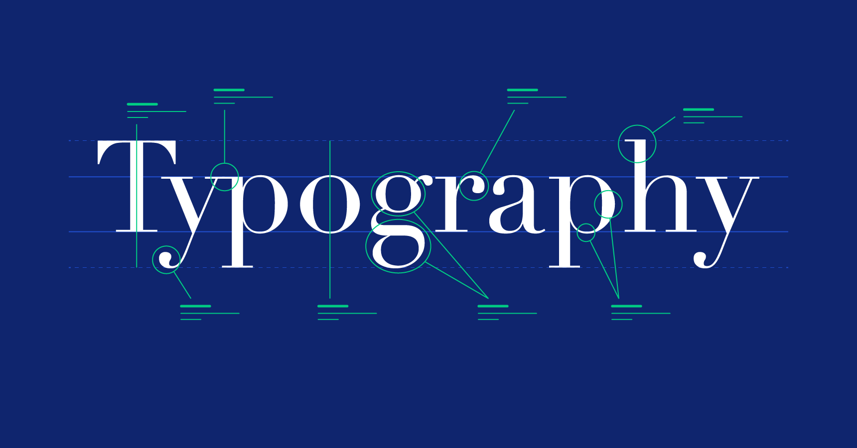
- Leading: Leading, pronounced “ledding,” refers to the vertical space between lines of text, measured from baseline to baseline. Adjusting leading can impact the readability and aesthetics of text, with tighter leading creating a denser appearance and looser leading enhancing readability.
- Tracking: Tracking, also known as letter-spacing, refers to the uniform adjustment of space between all characters in a block of text. Increasing tracking adds space between characters, while decreasing tracking reduces space, affecting overall readability and text density.
- Baseline: The baseline is an imaginary line on which characters rest, providing a consistent reference point for aligning text. Descenders, such as the tails of letters like “g” and “p,” typically extend below the baseline, while ascenders, such as the upper portions of letters like “h” and “b,” extend above it.
- X-Height: X-height refers to the height of lowercase letters, specifically the lowercase “x,” excluding ascenders and descenders. X-height is a key factor in determining the readability and proportions of a typeface, with larger x-heights often associated with increased legibility.
- Type Hierarchy: Type hierarchy refers to the organization and prioritization of text elements based on their importance within a design layout. By establishing a clear hierarchy through variations in font size, weight, and style, designers can guide readers’ attention and convey the relative significance of different pieces of information.
- Alignment: Alignment refers to the arrangement of text along a horizontal or vertical axis within a design layout. Common alignment options include left-aligned (flush left), right-aligned (flush right), centered, and justified (aligned to both left and right margins).
- Type Scale: A type scale is a hierarchical system of font sizes based on a consistent ratio or scale. Type scales help maintain visual harmony and coherence across different design elements, ensuring consistency and readability throughout a design project.
- Hierarchy: Hierarchy in typography refers to the organization of content elements based on their relative importance or significance. By establishing a clear hierarchy through variations in font size, weight, color, and style, designers can guide viewers’ attention and emphasize key information.
- Orphan: In typography, an orphan is a single word or short line of text that appears at the beginning or end of a paragraph, separated from the rest of the text. Orphans disrupt the visual flow and readability of text and are typically avoided in professional typography.
- Widow: A widow is a single word or short line of text that appears at the end of a paragraph or column, separated from the rest of the text. Widows create awkward gaps and uneven spacing, detracting from the overall visual harmony of the layout.
- Rag: The rag refers to the uneven or jagged edge of a block of text, typically on the right-hand side in left-aligned text or the left-hand side in right-aligned text. Achieving a smooth, visually pleasing rag is important for enhancing readability and visual appeal in typography.
- Lorem Ipsum: Lorem Ipsum is a placeholder text commonly used in design mockups and layouts to simulate the appearance of real text. Derived from Latin literature, Lorem Ipsum consists of nonsensical words and phrases that mimic the distribution of letters and words in natural language.
- Type Foundry: A type foundry, also known as a font foundry or type design studio, is a company or independent designer specializing in the creation, production, and distribution of typefaces. Type foundries play a crucial role in the typographic ecosystem, driving innovation, preserving heritage, and providing access to high-quality fonts for designers and creatives.
- Purchase Font: To purchase a font, designers can acquire licenses from font foundries or online marketplaces, granting them the right to use the font in their design projects. Fonts are typically available for purchase as individual licenses or as part of font bundles or packages, with pricing options based on factors such as usage rights, number of users, and intended application.
Kenneth is a proud native of sydney, born and raised there. However, he pursued his education abroad and studied in Australia. Kenneth has worked as a journalist for almost a decade, making valuable contributions to prominent publications such as Yahoo News and The Verge. Currently, he serves as a journalist for The Hear Up, where he focuses on covering climate and science news. You can reach Kenneth at [email protected].